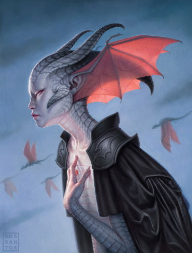
The fifth slot in my nominations list for this year’s Hugo Award for Best Professional Artist goes to Dan Dos Santos.
I have been a fan of his work for many, many years now and his book cover illustrations are a consistent presence on my annual Favorite Science Fiction and Fantasy Book Covers posts.
I will point out here, as I have for other artists on my list, it is not my long-time fondness that has informed my choice to nominate Dan Dos Santos for a Hugo Award, but the results of his production over the course of the last year.
There is one particular image alone that inspires my nomination, but we will get to that soon enough.
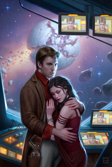
One of the questions asked of Dan Dos Santos is whether he creates his work digitally or using traditional painting methods. The answer is: traditional painting.
Dos Santos works in oils and achieves a look that is both uniquely his own, while understandably garnering comparison to digitally created works because of the effects he generates, in particular the way in which his paintings are lit.
It is probably a poor description, but I see a soft focus quality to his paintings, almost as if the works had been photographed with a filter in place. It is that soft focus which diffuses the light in such a signature fashion.
I also think Dan Dos Santos has a fantastic eye for composition. Whether he is rendering a dramatic moment like this cover for a Dark Horse comic or something fun like this cover for a Laura Resnick novel, Dan Dos Santos knows how to utilize the available space to his advantage.
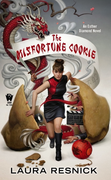
Special consideration has to be given to the placement of copy when creating a piece of art that will be reproduced as the cover of a book, or comic. One of the things I have admired over the years is the way in which Dos Santos is aware of how cover copy will effect his overall creation, yet he manages to create pieces that achieve a balance and stand on their own sans text.
I particularly enjoy the way he worked this Laura Resnick cover by making concession of the book title copy work for the illustration.
Many times the work Dan Dos Santos creates for genre book covers have a great sense of fun. This is abundantly apparent with The Misfortune Cookie. Dos Santos has taken a collage of elements from the story and worked them into the design, and his choice of emphasizing just a few colors, against a white negative space, serves to emphasize key elements in the painting that draw the eye all around the painting.
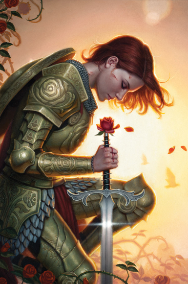
But for all that I enjoy the works featured here (I don’t believe the opening Dragon Empress image is eligible for the 2014 awards), and several others that graced books published in 2013, it is this cover image for an issue of the comic Fables that really stands out to me and says, “give me a Hugo nomination”.
This is simply a beautiful painting, from the choices of color used, to the way in which that color enhances the warmth of the light glowing behind the young knight, to the overall composition of the piece.
The first time I saw this cover I thought, “Wow!”, and that feeling has not diminished after several viewings.
Dan Dos Santos has made the Hugo ballot in the past, and I feel he deserves to be on there again this year.
If you would like to see Dan Dos Santos and his work up close and personal, be sure to make plans to attend Spectrum Fantastic Art Live 3 on May 9-11, 2014 in Kansas City, Missouri.
Next up will be a post showcasing all five artist I am nominating for the Best Fan Artist Hugo. Be sure to stop by, there is more amazing art to introduce.
Thanks for the tip off to another great artist, Carl, I can see why that picture blew you away: the central rose, framed by bright light that fades away from and around the central figure – the way the roses act as a partial frame on the whole, and (when you look closely) the juxtaposition of the blood on her hand (indicating to me that she’s holding a thorny stem tightly against the hilt) and the serene expression on her face. Nice stuff.
Do you happen to know if this image is something specific from Fables? I’m curious about where the rose motif might have come from.
Love your description of that image, and yes, it is a recent cover for an issue of Fables. I have had several cover images from that series jump out and grab me, and this is one of the best.
Dan Dos Santos’ artwork is fabulous! I’m impressed by the quality of all the nominees.
Thanks George, I do really enjoy the work of all 5 of these nominees. Now we wait to see if any of them make it onto the short list.