
Welcome to the February 2014 Edition of Cover Story, the new monthly feature showcasing genre cover art for works scheduled for publication within said month. I do judge books by their covers, at least on the first pass. It was the art on science fiction book covers that drew me in as a young reader, and I believe it is important to promote the artists and designers, and the book companies that employ them, for the efforts made to keep alive the grand tradition of eye-catching genre cover art.
(Monthly Disclaimer: I am not an art critic and have no formal artistic training. “Eye-catching” means exactly what it says, these images caught my eye and drew my attention to the works they grace, compelling me to search out more information about the book. Opinions contrary to mine, and suggestions for works that I missed that caught your eye, are always welcome.)
With those formalities out of the way, let’s get to the cover art, shall we?
Title: Dryad-Born
Author: Jeff Wheeler
Publisher: 47North
Release Date: February 4th
Artist: Magali Villeneuve
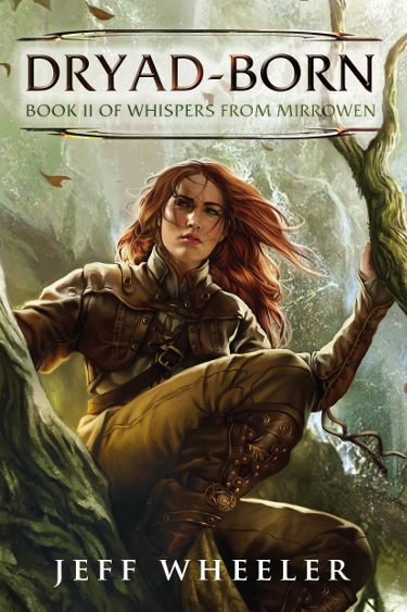
One of many reasons this cover stands out is that Magali Villeneuve interprets the character as a realistic woman, beautiful, as women are, but not impossibly proportioned or Glamour Shot gorgeous. The outfit design is both practical and attractive in a manner that fits the setting. The cover for Dryad-Born features rich earth-tones and the image is lit in such a way that the color choices for the character’s hair and clothing radiate warmth. I particularly like the detail on the leather boot. This is also where I’m contractually obligated to point out that I am partial to redheads on cover illustration.
Artist Magali Villeneuve has created illustrations for role playing and collectible card games for Fantasy Flight Games for franchises such as Star Wars, Warhammer, and The Lord of the Rings. Her illustration of Arwen Undomiel is particularly gorgeous.
Title: The Gospel of Loki
Author: Joanne M. Harris
Publisher: Gollancz
Release date: February 13th
Artist: Andreas Preis
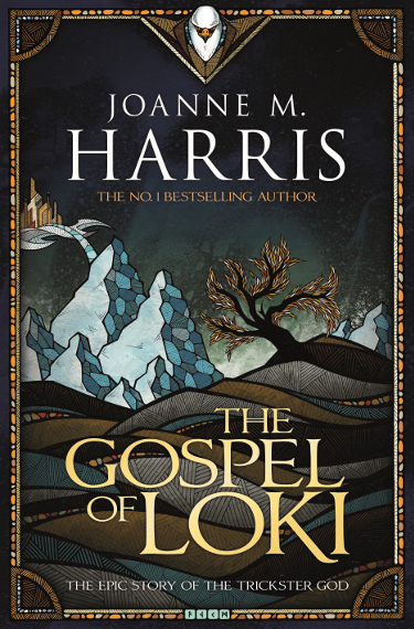
Artist Andreas Preis has a great sense of design and his cover illustration for The Gospel of Loki is stunning. Preis utilizes cross-hatch elements here and you can see that in much of the work featured on his website. Like all of the artists featured here, it is worth taking the time to explore their body of work.
I like everything about this cover, from the mosaic design elements around the border to the color choices that present a winter aspect without limiting it to shades of white. As I have gotten older, I have begun to find beauty in the stark, muted colors of dormant nature. I am especially drawn to the patterns and colors used on the face of the snowy mountains. The illustration creates a sense of texture and depth because of Preis’ design and color placement.
I want to give a shout out to the design team at Gollancz for font/color choices and word placement that allow the cover art to work its magic.
Title: Seven Wild Sisters
Author: Charles de Lint
Publisher: Little Brown Books for Young Readers
Release Date: February 4th
Artist: Charles Vess
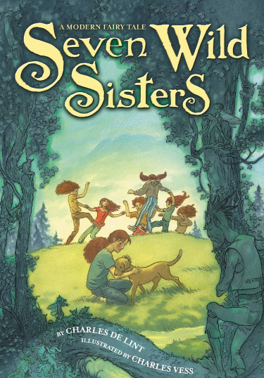
Seven Wild Sisters is a companion novel to last year’s The Cats of Tanglewood Forest, which was also illustrated throughout by multiple award-winning artist Charles Vess. When you pick up this book you are promised page after page of paintings that work directly with the prose.
Charles Vess imagines the mundane and magical in ways that make you wish you could step through into the realm of the Fae. I am intrigued by the girl in the foreground. Is she looking back towards the fairy-filled woods with longing or fear? Perhaps a little of both?
Charles Vess often includes small details that reward a more careful viewing. In this case we have fairy tale creatures and a cat blended in amongst the trees, for example.
Title: Judge of Ages
Author: John C. Wright
Publisher: Tor Books
Release Date: February 11th
Artist: John Harris
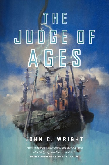
I admire consistency in cover design across a series, and Tor has done right by author John C. Wright with his Count to a Trillion series by retaining John Harris to paint the covers. Harris has maintained a consistent color scheme for these books, emphasizing blues and a few pastel hues.
I am drawn to the work of John Harris because his visions of the future marry contemporary ideas with a nostalgic sensibility. He imagines the future in a way that recalls science fiction artists who have come before, giving his work a richness of history.
I look at this image and immediately am curious–why is this giant mechanical claw apparently ripping a section of the city from its foundations? Where is it being taken? Is this a visual metaphor of the insignificance of humanity in the face of the universe; are we simply a cheap prize to be won in a cosmic game of Claw?
Title: The Waking Engine
Author: David Edison
Publisher: Tor Books
Release Date: February 11th
Artist: Stephan Martiniere
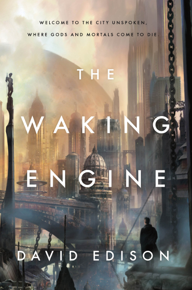
Stephan Martiniere is a digital master, creating lush, beautiful landscapes. His illustration work for The Waking Engine blends familiar and fantastical elements to create worlds that we long to visit.
The cover tagline indicates the presence of gods and mortals in Edison’s story. Those ideas are reflected in Martiniere’s illustration. There is a human character gazing over the ethereal city while a large statue on a high pedestal looks down on him. The majority of the buildings we see surge upward, recalling ancient architecture designed to point man to the heavens where God resides.
Though it may not be something we see in our telescopic images of the universe, I enjoy it when artists render planets in close proximity to one another. It is a visual representation of the fact that the universe is massive and majestic. In this case it also serves to give some detail about the setting of Edison’s story.
Title: Three Princes
Author: Ramona Wheeler
Publisher: Tor Books
Release Date: February 4th
Artist: Raphael LaCoste
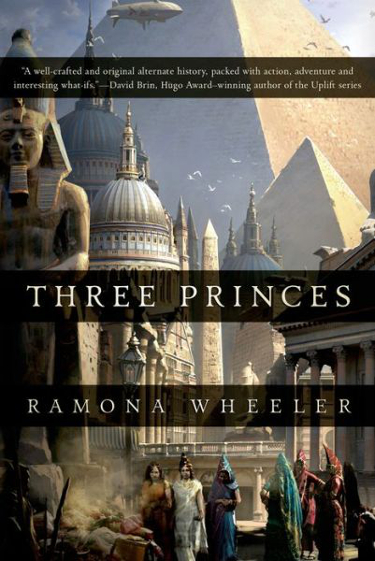
Artist Raphael LaCoste builds upon a similar cityscape theme for Tor for Ramona Wheeler’s new novel. Instead of futuristic design, however, we see the architectural wonder of Egyptian design, representative of an alternate history future Earth in which the glory of Egypt continued to dominate the culture. There are also some Roman influences as well.
LaCoste paints a city that gives the impression that it bustles with life, making the reader/viewer curious about the activity occurring with the women shown on the cover. I like the way there is an instant familiarity with setting when you first look at this image because of the historical context of the buildings and yet LaCoste incorporates the airship in the background, giving that slight nod to the audience that there are fantastic elements afoot.
Title: Jubilee
Author: Karl Schroeder
Publisher: Tor.com
Release Date: February 26th
Artist: Richard Anderson
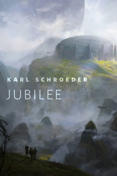
Artist Richard Anderson was commissioned to create a piece for this original work of short fiction for Tor.com that will be available for your reading pleasure, free of charge, at the end of the month. He created a gorgeous illustration that makes me anxious to know what Schroeder’s story is about.
Though at first glance this looks like it might be a fantasy realm, the aforementioned close planet, along with the structure seen in the distance and what look like small ships in the air lead me to believe that the story will have science fictional leanings. Does anyone else think the ship on the right, mid-way between the top and bottom of the image, looks like a particular Firefly-class vessel? Click here to see a bigger version of Anderson’s illustration, after which you can commence making fun of me for my fanciful imagination and poor eyesight.
Richard Anderson, like the two artists featured immediately above, creates beautiful landscapes that make you wish that you could, Narnia-style, walk through a magical door right into the midst of that place.
Title: Fallout
Author: James K. Decker
Publisher: Roc
Release Date: February 4th
Artist: Dave Seeley

My final selection for February includes a personal rant. It is not my intent to stir up controversy, instead I am curious about your opinions, which may be very different than mine. I was drawn to Dave Seeley’s cover for Decker’s first book in this series, The Burn Zone. You can follow that link to see the cover image. I liked the image, but in my naivete couldn’t fathom why an artist would take the time to paint an image that appeared to be the artistic version of the family “photographer” who always cuts off the heads of people at family gatherings. Months later when I was looking for an image from another novel illustrated by Dave Seeley, I discovered this.
You can imagine my confused, “Whaaat?!?!“.
As you may have guessed, the image that opened this post is Dave Seeley’s full image for James K. Decker’s novel, Fallout, which, as you can see above, sports the same quasi-decapitation motif. I can easily understand the desire to tone down some of the background images and to bring the focus in on the character. Many of the covers that sell us books are cropped versions of larger images. Allowances have to be made for title and author information as well as considerations for how an image may translate when rendered down from its original size.
But I don’t understand the head thing. Don’t get me wrong, I like these covers. But why crop it this way? I know there has been a trend to have covers, particularly those featuring photographs, to be neck-down shots and I gather that part of the reason is to give readers the ability to imagine the person’s face based on author description. But this partial head thing, from a commissioned painting, is confusing. And in an environment where we are becoming ever more conscious of white-washing covers for books featuring non-white characters (the character featured here is Asian), this seems even more egregious.
Please don’t misunderstand, I am not leveling accusations at Roc. I have no doubt that the artistic director(s) have their reasons for this and there may be many of you who prefer the covers this way compared to the complete Dave Seeley image. What I am saying is that this sort of thing can send the wrong message in our highly sensitive world. I’m also saying I would prefer to see the entire character that Seeley painted on the cover, not just her body and half-severed head.
There you have it, my choices for stand-out genre covers for books being released in February 2014. There are books I missed, so tell me what they are and feel free to leave links. Weigh in on your thoughts on the Decker covers, but please don’t villify the folks at Roc as they are consistently putting out good books with nice cover art and I don’t believe there was any intentional shenanigans going on with their cropping choices.
Special thanks to John DeNardo for his monthly SF Signal post that tempts us with the hundreds of genre books set for release each month.
In case you missed it, here is the January Edition of Cover Story.
Carl, I too judge a book by its cover, and love gorgeous covers just for their art. My favorite here is The Gospel of Loki, with The Waking Engine a close runner up. It is great when publishers put the effort into a stunning cover.
With the economic temptation to do a simple text-only cover, I feel a duty born of love to praise those publishers who continue to commission art work/design work for book covers.
Three Princes and Waking Engine have very similar covers but I love them both. Cityscapes are usually my favorite.
I’m right there with you, Nathan. I really enjoy cityscapes, particularly science fictional/futuristic ones. You should check out these posts by Joachim Boaz featuring classics with cityscape art. Very cool stuff here: http://sciencefictionruminations.wordpress.com/?s=cityscapes
What a great blog you pointed out, Carl. Wish I could look at cover art all day.
Joachim’s site always has great content. Interesting reviews and frequent posts featuring thematic cover art or his latest finds. Lots of great, and not so great, classic cover art that is always interesting to look at.
Thank you, this is a nice one.
You are welcome, it is a great site.
Thanks for the kind words
Thank you for running such a consistently great site.
I am looking forward to the Charles de Lint book. It is on its way to me in the mail!!
I was going to see if I could snag it from the store on Tuesday, but record snowfall meant that Barnes and Noble was closed. There are a couple of books featured here that I’ll be grabbing.
Back in the day when I went into a bookstore with limited funds and limited time to look I had a few criteria I used for making a selection.
1. I looked for anything new from authors I already knew and liked be it a series or standalone and there covers didn’t matter as much.
2. After going through and looking at known authors I looked for what caught my eye from authors I haven’t read before. That is where covers are important because with the limited time I had I could only look at X amount of book blurbs and the ones that had better covers got picked up and perused.
Now with E-readers covers are actually more important because of the ease of self publishing. There is large amounts of dreck on Amazon, B&N and other places to wade through and a good sign is where the author at least takes the time to find a good cover or even hire an artist to make one for for their work. I have found some pretty decent books in the low price to free areas of those sites and the thing that made me read the description and thus buy the book was that the covers were good.
Covers always matter to me in the sense that I get disappointed when authors I like end up with book covers I don’t…but I am with you in that I’m going to be buying it anyway.
I have discovered sooo may authors because of great book covers. Even today when I am turned on to new authors by the words people online write about them, a good cover may be the key ingredient in deciding what I’ll buy and when I will read certain books.
Thanks for your “back in the day” thoughts, Robert. Makes me nostalgic for the way I used to buy books (and still sometimes do) before Amazon and ebooks entered the fray.
You are SO RIGHT about the dreck. Oh my! I wish self-published authors and some of the tinier presses would invest in either hiring talented designers or finding a friend with some real talent to bring on board.
Hi Carl.
When you say “I am not an art critical” I assume you mean critic. I think you do a fine job none the less.
I am really enjoying your new monthly cover reviews. It doubles as book suggestions and cover art review. Perhaps the big surprise was following your links to the art work sans cover text.
I like the artwork of Magali Villeneuve. I must look for more.
Thanks
Ha! Nice catch, Ian. The old brain was addled this morning as I missed that on two proof-reading runs.
Thanks, I’m having fun doing it. Dawned on me when doing my annual one that I ended up leaving off so many great covers that it would be better to do a monthly feature and pull my favorites from that list at the end of the year.
Magali Villeneuve’s blog has several examples of her work and she is very good.
Oh my, just scrumptious. Lots to say here. Eight covers, eight books.
Have you read anything by Jeff Wheeler? I haven’t, but in looking over the books listed on A’zon, he’s written a lot of fantasy and many of the covers are good. The one on the first book of this series, not so much, this is a big improvement and like you I think it’s very good.
The Gospel of Loki may be my favorite, I wish I had a bigger image. I wish I’d drawn/painted it. I wish I had the book in hand.
Seven Wild Sisters is pretty typical Vess, so the more a person likes his style, the more they’ll like this cover. I’m damned if I can spot a cat anywhere. Oh, wait, is that it at the bottom left side?
Judge of Ages – anything by Harris is good by me. The cover immediately reminded me of the City novels by James Blish. Take a peek at this Analog cover: http://www.sffworld.com/forums/showthread.php?23193-Mega-cities-and-Science-fiction/page2
The Cities in Flight stories are really worth reading.
The Waking Engine has Martinere, but I would hardly call his images “lush”, it seems he always uses either desert tones or hard cold ones. Nice cover though, and you know I like his work.
I like the cover to Three Princes, with the Egyptian, Italian, Greek (or Roman?) elements plus that blimp. Alternative history novels usually aren’t my bag but this is an intriguing cover image.
That cover to Jubilee really draws me in, probably my second favorite cover of the bunch. Again, I need to see a larger image.
Okay, that brings me to <iFallout. You’re being nice in what you say, but I don’t have to be quite so polite, instead I’ll speak my mind: The designer for these two covers is forcing her/his “artiness” on the covers by doing that head cut-off thing. I’m sure this design solution has some “artistic” justification in that person’s mind, but for me it’s just plain a bad choice. If the person who approved this design thinks it will help sell books (maybe because it’s mysterious or something) that person is mistaken. If the decision was to sublimate the image and promote the text, that’s a very questionable decision also. The original images are much more appealing. BTW, I think the woman on the first cover looks like a young Tina Turner…
That’s it. I really like this feature and am already looking forward to the March post.
Your wish is my command, Richard. Here is a link to a very large version of the cover for The Gospel of Loki:
http://www.gollancz.co.uk/wp-content/uploads/2013/10/gospel-of-loki.jpg
I haven’t read any Wheeler. Feel the same way you do about the first cover for this series vs. this one He has some really good reviews for his work.
Yes, you nailed it, that is where the cat is. Yes, Vess’ style is a signature style. There is a stylistic similarity to the work of Michael William Kaluta, although they each have their own unique touch on it. I’m a fan of both.
“Lush” probably isn’t the right word for Martiniere, but the colors of this one brought that word to mind.
I was thinking Roman for the columns on one of the buildings, but there are a lot of influences there. I like what Anderson did with that cover. It is busy, but in a good way. Interestingly, some of the negative reviews I’ve read for Three Princes make it sound like something I might enjoy. I haven’t read much alternate history, so I don’t have a good grasp on what is out there. I know I like Cherie Priest’s Clockwork Century series, beyond that I haven’t read much.
Here is the larger Jubilee image (which is also linked in the post):
http://readeroffictions.com/wp-content/uploads/2013/10/Jubilee-Karl-Schroeder.jpg
I’ll be reading that one when it gets posted on the Tor site.
I appreciate you sharing your thoughts on the Dave Seeley covers…or rather how they are presented. It is tempting to shoot him an email to see what he has to say, although for him it is probably not something he would say a lot about given that it is a paying gig, with two covers so far (or maybe three, I need to see if he did the art for the work of short fiction set in this universe, Ember, that I’m reading right now…sneak peek for this Friday’s SF Signal post!)
Appreciate you sharing your thoughts on the covers. I do enjoy reading/hearing others’ opinions about art. It helps me evaluate my own thoughts and seeing things through the eyes of another is enlightening.
That is a great Analog cover!
To add… that Richard Anderson illustration is one of my favorites of his work. I’m guessing this will be an on-line Tor item, not part of an actual book, thus not really a “cover”. Am I mistaken?
You are correct, though Tor always puts these free stories online for .99 or 1.99, depending on length, if you actually want it in ebook format. I’ve purchased the longer stories that way before as it is easier to read on the Kindle and well worth the buck to read it that way.
I’m starting to lean toward the purchase of an iPad, which would make reading digital books doable for me, I think. In which case the Tor stories would be near the top of the list.
Jeff, who you’ve interacted with here before, uses the Kindle app on an iPad to read ebooks and likes it very much. Making it even more appealing is when books are on sale for $1.99 and you can get the whispersync audio version on audible for the same price, allowing you to alternately read or listen on the same device.
Love The Gospel of Loki cover! It looks like a quilt, a very unusual style for an SFF cover.
It is very atypical, and cool to boot!
Great post — I love well-done book covers, especially as I have had truly awful covers on my books over which I had no control. I too love the Joanne Harris “Loki” cover — it’s clean and elegant. And on the other hand, I like the Decker too — just wish they had included the head! The whole figure is really compelling.
Hey! I hate how easy it is to lose touch with people (my fault). I haven’t seen/spoken to you in forever. I hope to do better, so great to hear from you!
I ache for authors saddled with unattractive book covers. I cannot imagine pouring my heart and soul into a creation only to have it shamefully presented to the public.
I don’t get the Decker covers at all. I’m dying to know what Dave Seeley thinks of them.
Isn’t the Loki cover wonderful?
I hope it isn’t weird if I chime in (a Google Alert pointed me here). First off, I think my favorites (excluding my own, of course) are “The Gospel of Loki” and “The Waking Engine”. I love the stylized look of “Loki” (which puts me in the mind of a stained glass window) and “Waking” caught my eye because I’m a sucker for a good urban sprawl – these are all great though.
I consider myself very lucky to have gotten Dave Seeley’s artwork for my covers – I just love his work (when I saw the full painting that The Burn Zone cover was taken from, my jaw dropped). I can say definitively that neither he nor I know for sure why they chose to crop the heads, but my feeling is that it was just to add an element of mystery (though I’d agree, it’s a disservice to a perfectly pretty face!) Still, all things considered I was very pleased when I saw them – as an author you don’t get to steer the artwork as much as you’d like, so it’s always a finger-crossing moment when the cover shows up. To find Seeley’s work in my inbox was a pleasant surprise.
Not weird at all, very cool that you are taking the time to share your thoughts.
Loki most definitely gives off a stained glass window vibe.
So great to know that you like your covers and are equally mystified as to why they are presented the way the are. I mean, they look really nice (just picked up Fallout over lunch today), but the full images are so much better.
FYI, I read your novella Ember while off on a snow day yesterday and have a review of it queued up to go live on the SF Signal site tomorrow. I liked it so much I immediately started in on The Burn Zone after finishing it. If the novels are anything like the novella (and about 100 pages in The Burn Zone is great), I’ve got some great reading ahead of me.
Glad you’re enjoying them – music to my ears!
🙂
Just checked and the Ember review goes live at noon CST tomorrow.
loving this feature. and I love that SFF invests in their cover art. that Harris cover is striking,
Thanks Leslie! I’m so glad Harris is still regularly producing cover artwork. His work reminds me of why I fell for this kind of art back when I was a young kid reading SF for the first time.
Beautiful covers, but I can’t help notice that the MC in Decker’s series is a woman of color, and yet the publisher/cover editor cut off the upper half of her face, effectively hiding this fact. I don’t know if that was intentional, but it makes me sad. It’s otherwise a stunning cover.
It makes you wonder. I alluded to such in my statements about that, and if you haven’t checked out Decker’s comments here in this post, Stacey, they are well worth reading. At the very least the decision makes for some uncomfortable assumptions about why it was done. Not once, but twice (as they did it again with the newest book).
Ah yes, I see it now. I think I was so perplexed wrt the full image and the crop, that I must have skimmed right past the white-washing comment. Regardless of whether that was the publisher’s intention, the effect certainly opens the publisher up to that kind of criticism.
Oh yes, definitely. I cannot imagine what the thinking was here. Makes no sense.