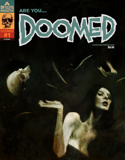
(Cover to first issue of Doomed from IDW Publishing)
My previous Friday Favorites have tended towards a more bright color palette. Today I offer the more dark and earthy work of Ashley Wood. Mr. Wood was born in Australia and today splits time residing between his native land and the United States.
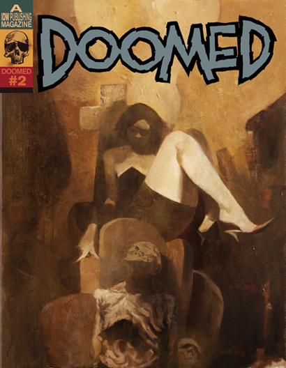
(Alternate cover for Doomed #2 from IDW Publishing)
Despite doing illustration for a number of clients from Microsoft to Sony to Warner Bros., Ashley Woods has made the biggest name for himself in the comics industry here in the United States, particularly with the various books he has worked on from IDW Publishing. Ashley Woods’ unique works began gracing the covers of the comics Spawn and Sam and Twitch from Image Comics and then moved on to other horror driven works like 30 Days of Night for IDW. Not content to work solely on the creations of others Ashley yearned to do his own work, the most notable being his creation Popbot.
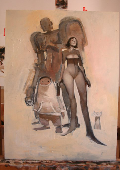
Popbot is an interesting, non-traditional, adult comic work. In Popbot Ashley has been free to use his impressionistic style to it fullest. What has resulted is a work that is interesting to look at but takes some imagination and persistence to read.
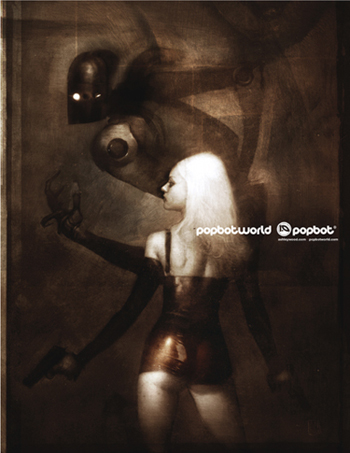
Ashley describes Popbot as featuring “an eclectic cast of characters starring a talking rock star cat, his robot bodyguard, sexy women, robot-ninja assassins, and more…”. I can attest that it indeed does. It is no great revelation that I love robots, and few warm blooded males don’t like sexy women, but after 3 or 4 issues I personally decided I had to wait until at least all 13 issues were out before I delved any deeper. Ashley Wood has mentioned in interviews that all will make sense once all issues are completed but he also levels some complaints at American comic readers who he feels need to be spoon-fed stories. There may be some truth to that and I respect his opinion. Regardless of the sometimes cryptic nature of his stories, the art in Popbot and other works is terrific.
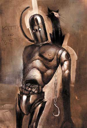
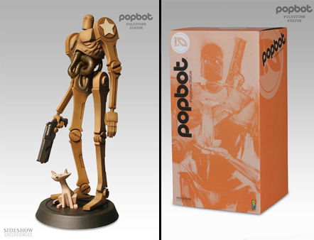
The kitty in Popbot is based on Ashley Wood’s own cat, Eddy. I really like his take on robots, they have a real fluid movement to them despite being depictions of machines.
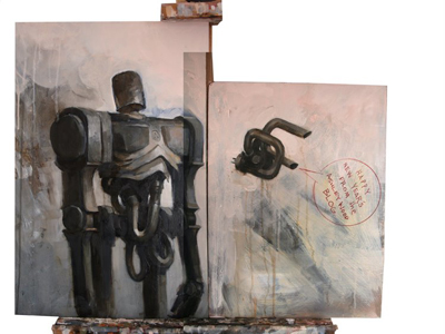
The work of Ashley Wood is that of traditional painting techniques occasionally coupled with digital photography and graphics software. I enjoy Ashley’s work for a number of reasons. The subject matter appeals to me on many levels and I absolutely love the darker tones Ashley uses in the bulk of his work. Ashley Wood has a very unique take on the human form. Women, men…even robots and cats, tend to be shapely, elongated, kinetic representations of the real thing. The fact that there is a realism in the midst of his very unrealistic proportioned characters makes his work fascinating.

Ashley Wood has recently joined the blogging community. I enjoy it when artist’s have their own blogs as they often post works in progress, etc. Ashley Wood’s blog is no exception. When an artist paints as well as Ashley does I enjoy seeing their process and especially like finding out what their initial pencil sketches look like.
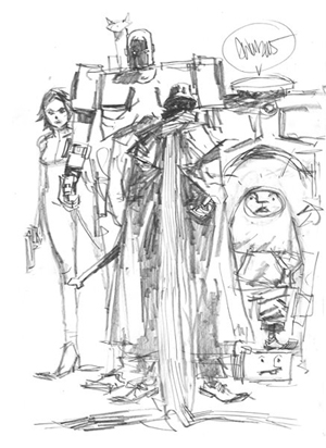
Ashley Wood’s pencil sketches are great art in their own right. In addition to his painted works he has done more traditional work on comic interiors. Here is an example:
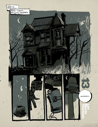
I love that image not only for the interesting colors, but Ashley Wood draws a mean old creepy house. Whatever the odd reason may be, I always appreciate a comic artist who can draw a good old eerie house or castle. Mike Mignola is one of my favorites who does this to perfection.
Recently Ashley Wood’s creation has had the honor of being turned into a collectible statue. I can think of nothing more cool as an artist of graphic novels to have your creation turned into a three dimensional format. They have done a marvelous job with the Popbot statue and I love the packaging as well.
Ashley Wood’s latest venture for IDW is the series Lore.

Lore is the “masterpiece of mythology gone wild, which presents the story of Jennifer Bradley. Thrust into a world where beasts of legend are made flesh, Bradley must unravel the story of her father’s mysterious death before humankind is wiped out forever.” Sounds interesting and I may have to check this one out.
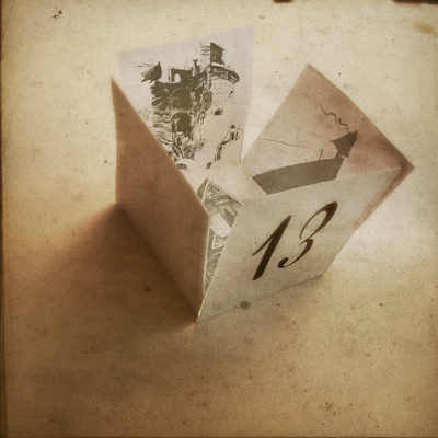
The above image is so interesting because it reminds me of the art in Mirrormask. It is a fascinating piece that makes me very curious about the images inside the box and what it all means.
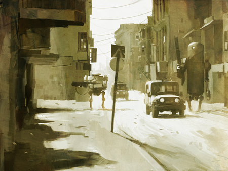
Despite the fact that the above is a fantastical image of robots on the battlefield that image has a really cold, powerful feel to it. Really makes me think of the current middle east situation.
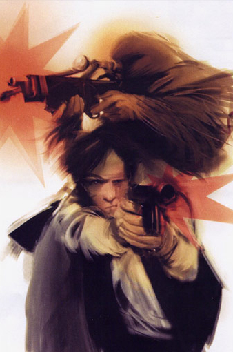
How could I not include an image of my childhood idols Han and Chewie?
Like all the art I share I realize that it is not for everyone but I love taking the opportunity to share the many and varied things that I’ve stumbled across in my reading, internet searching, etc. that has caught my attention. The works of Ashley Wood fire my imagination with his use of subdued color, his movement, and subject matter which is right up my alley. I hope you enjoyed today’s Friday Favorites but am just as interested in hearing if you didn’t. The point is to stimulate conversation, share some art, and hopefully inspire creativity. Check out more of Ashley Wood’s work at his sites that I linked to in the post as well as at your local comic shop. His printed works are definitely for mature audiences, so don’t be buying them for the kiddies…for the kitties, well, that’s another thing altogether! Happy Weekend Everyone!
This is really, really good stuff. May even be my favourite thus far. Love the tones and mood of each piece.
Very cool.
“Mood”….great word FM! I was so brain dead this morning trying to type things and I think my grasp and command of the English language was severly lacking. I knew what I wanted to say but felt like I had a vocab of about 5 words in my head. Yes, Ashley’s work definitely conveys a certain mood which works very well with the horror/mythology/surrealism of the subject matter of his books: Lore, Popbot, Automatik Kafka, etc.
Thanks for the comments FM!
Here from Michele’s today but great art 🙂
gosh, I really like this guy’s work. Love the palette he’s chosen, and although I’m not a robots/sci fi type person I find his work very attractive. It’s defintely caught my attention.
michele sent me.
Wow, I love this guy’s stuff, it’s fantastic!
Here from Michele’s…have a great weekend!
Wow is really all I can say about that artwork. Really striking. Oh, I guess I said two things. Michele sent me.
Cool artwork. I don’t really know much about it, but this stuff certainly captures a whole load of emotions, ideas and concepts for me, so that’spretty good in my book.
Here from micheles
There seems to be this…ugh…what? Movement? School of thought? Whatever…in comics art and it mostly springs forth from IDW publications. The Ben Templesmiths, the Ashley Woods’ and, to some extent, the Dave McKeans all adhere to this aesthetic that is highly impressionistic which leaves the audience to make a lot of the decisions as to what exactly is going on in the art. Even the colorist and cover artist for one of the books I’m writing digs on this aesthetic (his work can be seen at http://www.cmnmd.com). For some stories, this can be very cool. For others, however, it’s self indulgent crap that has left me putting otherwise good books down, unfinished.
While I can appreciate this style for what it is, I think I’ve been put off by it very early on in my comics reading career (I’ve really just started reading them in the last year and a half so I guess I still am in the early days of my comic reading career). It all began when I read 30 Days of Night. I just…couldn’t…stand Templesmith’s art in that book. It didn’t contribute to the story in the least. Didn’t make the concept any more creepy or engaging. It just made the book annoying to look at. Since then, whenever I see this vaguely impressionistic style, I have a knee jerk reaction to it that makes me wary of its quality. Of course, this is stupid as muted palettes, darker themes and bold lines just sing to me viscerally. However, my inherent disdain for the style has changed thanks to the exquisite and all around kick ass design of Dave McKean’s in MirrorMask (Clockwork Janes in the Box = Rob gets all sticky tipped).
I don’t have a lot of exposure to Ashley Woods’s work. Some of it recalls that tang in the back of my throat left there by the self indulgence of Ben Templesmith. Some of it is freaking ridiculous great (the Robotwar painting is fucking gorgeous). You’ve convinced me, though…my next trip to the comics shop is going to be devoted to Popbot.
Another good post, brotha. Thanks again for furthering my education.
Thanks for all the visitor’s from Michele. I appreciate your comments and look forward to doing more weekend visiting and receiving visits from her site.
Great thoughts Rob. I enjoy comics, movies, etc with this style of art that make you work on certain levels to fully understand what is going on. But to me these things only really work when there is a good foundational tale and that the reward for looking deeper is to get more out of the story. That’s why Mirrormask works so well. There is a great story but there is SO MUCH MORE going on. Reading my rather lengthy review of Mirrormask shows just a taste of what I personally got out of it and there is so much more to reward repeated viewings.
I like Templesmith’s art on 30 days well enough except there were parts occasionally where things were just too dark and were to hard to figure out what was happening. It would be interesting to see if those were simply printing issues or if they were indeed that incomprehensible on the actual original artwork. I really enjoyed the 30 days’ stories and I thought the art for them was interesting, but IDW’s stuff is definitely all ‘to each his own’ works. That’s why I mentioned that Popbot itself was kind of hard to get sometimes.
I meant to link to an Ashley Wood interview that I perused while writing this and will do so here. It is interesting in that he raises some of the same issues that you did Rob in his own unique way.
I know how you feel about certain poorly used concepts ruining other similar artistic works for you but I would encourage you and everyone that if you do like something don’t let its overuse or poor use turn you off…just do your best to stay away from the crap and seek out the best examples of it in whatever forum you can find it.
Really enjoy your responses Rob and hope you continue coming back for more.
I like the work on that link you put in your comment Rob, especially like the Faith, Nature, and Free illustrations.
I always appreciate being exposed to new art. This work isn’t something I’m familiar with in the least by I enjoyed it. It isn’t easy to get such depth in all dark tones but the artist was able to do it. Hi by the way, Michele sent me.
Funny, I loved 30 Days of Night because of the artwork. I thought it added quite a bit to its mood and dread.
Me too except once in awhile there was a panel here or there that looked like he got rushed or sloppy as there was no logical explanation for why the panel was incomprehensible. Overall it was a great comic and I enjoyed all the storylines. It definitely was a dark and moody book.
I’m also a big fan of the art on 30 days of night. I have fallen behind on the series. Maybe when the movie comes out I’ll want to get caught up on the story. I’m also a fan of Ashley Wood’s art but it had to grow on me. At first glance I was put off but then as I saw more of his work I found some incredible pieces. His art feels more like a series of paintings rather than traditional comic book artist pages. In that way I find myself loveing some pages or paintings and then finding others that do nothing for me. I’d rather have him produce work like that though than just middle of the road “safe” pieces. We already have enough artists like that. Of the above pieces my favorites are the number 13 box and the robots in the street painintg right below it. Another great post Carl! Thanks.
Glad you mentioned the number 13 box Jeff. Of all the stuff I posted its my favorite only because of the feelings of mystery and intrigue that arise in my looking at it. It really does look alot like Mirrormask art, and there’s definitely a story in there! Overall though I really like all this stuff and am a big fan of robot/women art of all kinds.
Thought you might be interested…there’s an excerpt from one of the comic scripts I’m currently writing on my weblog.
I’ll check it out, thanks rob!
HEY I´VE WATCHED ASHLEY WOOD´S WORK SINCE SPAWN
LOVE THE VARIATIONS OF THE STYLE IS ALWAYS MOVING SO DINAMIC
ASHLEY WOOD IS MY HERO JEJE
He is indeed fantastic. One of those artists whose work always excites me.
bobobobobobobobobobobob
GREAT SITE AND IMAGES!
Check out Woods blog for peeks at a new figure we are working on
also stop by our site
http://www.bigshottoyworks.com
Thanks KLIM, I will check it out.
I love the rant from “Rob” about how crap Ben Templesmith is. The guy sounds deranged and like he has an axe to grind. Typical of anyone who ignorantly criticizes his work, they’ve only seen that first rawest book, 30 Days of Night. Literally Templesmith’s first published work. Wow, if only Ashley Wood was judged the same way.
There’s a reason Templesmith has been in the running for an Eisner award for the past 4 years running “Rob”. And there’ a reason they made a movie from the book 30 Days of Night, thanks in large part to the visuals. It’s great to see people who take risks succeed. Perhaps you’re just a bit bitter and jealous since you couldn’t just bring yourself to say “That sort of dark art doesn’t fit all stories and is not for me”. It speaks badly for you, and your feelings on your own artistic endeavors.
Sammi has the makings of a great artist, soon as he gets some confidence and stops cloning Ashley Wood’s “Hellspawn” style of several years earlier. The beauty of Ashley is he has various styles, only the most recent of which is shown here. Check out his Hellspawn work to see where Makkonen get’s his ideas and inspiration from. In a few years he will be a force to be reckoned with.
Don’t be too hard on Rob…er, Rob. We all have our opinions, that’s what makes the world go round. I don’t agree with his, but it is okay for him to have it. The art is what made me pick up, and keep reading, 30 days and other of BT’s work.
If this is where Sammi is starting I’d say he is off to a very good start. One of the things I’ve really appreciated about reading the last several Modern Masters volumes I’ve read (Frank Cho, Mike Allred, Mark Schultz) as well as other recent art books is that they all go way out of their way to discuss their influences and encourage other artists that there is nothing wrong with aping another’s style, especially when first starting out. If what inspires you is what you shoot for to get you on the path that is great. Over time if a person keeps with it they will naturally develop their own tweaks on that style but, in my opinion, even if they only vary but a little it is still a valid art form. Everyone is influenced by one or many other artists and that certainly should, and does, show in their work, especially their early stuff.
If you decide to pick up Blue I hope you enjoy it.